Stucco.
Brand identity, website and marketing materials for a plaster and drywall studio in the interior of São Paulo state. The goal was to show the standard of finish on every job, show up in local searches and turn visits into quote requests on WhatsApp.
In this demo the brand, contacts and testimonials are fictional; the photos are the studio's real work, used with permission.
- Year
- 2026
- Status
- Live
- My role
- Brand identity, UI design and front-end development
- Client
- Plaster and drywall studio, name withheld
- Demo
- 5 pages in English, with a fictional brand. The live site is in Portuguese.
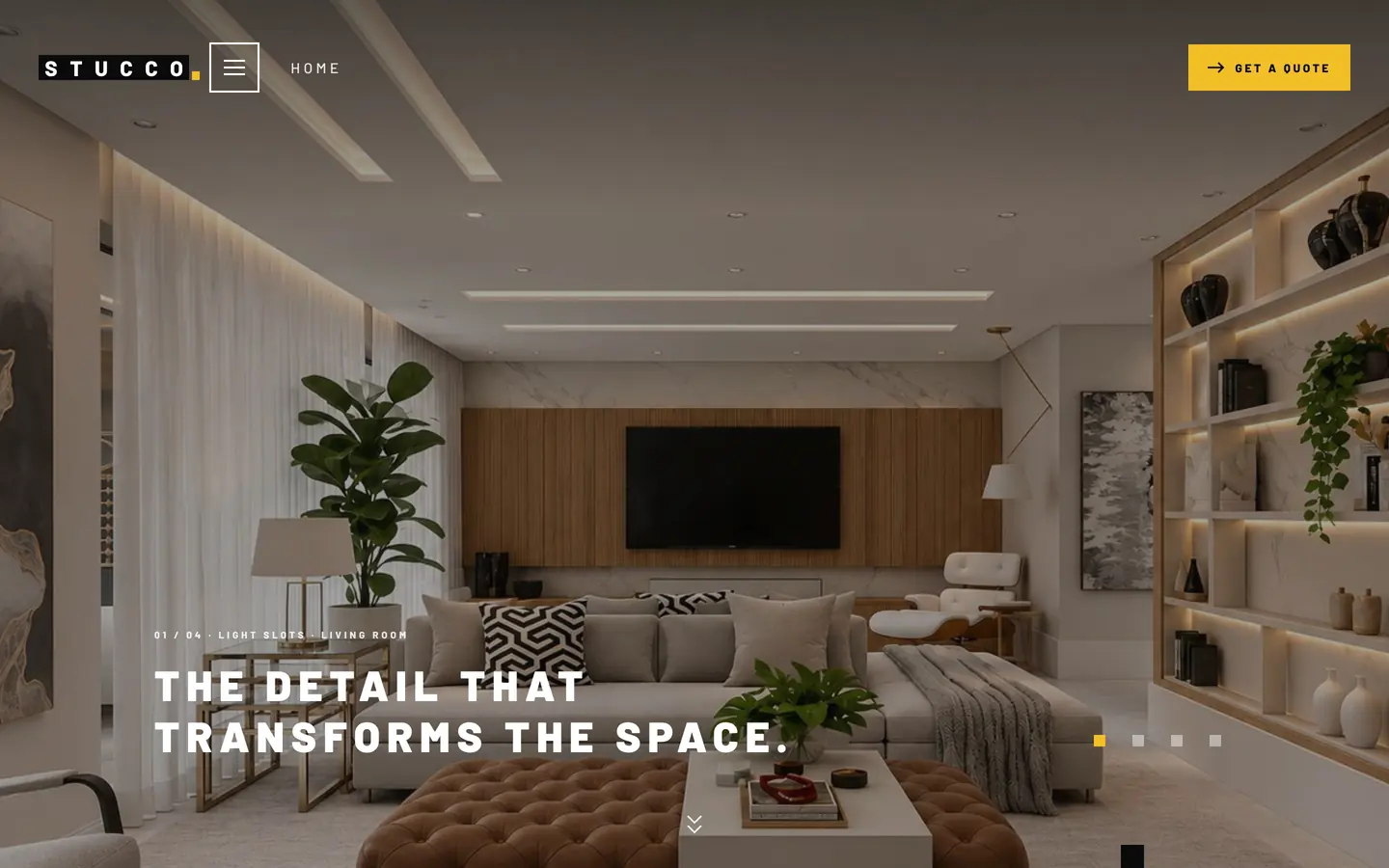
The studio's own work opens the site in a slideshow, with a caption and counter for each photo.
01 / 11 · Home: Home
02The brief
The studio lived on referrals and social media. There was no single place that gathered the work, explained each service or made clear which cities the company serves. The client asked for:
- a site that feels like an architecture office, not a generic contractor;
- fast and easy to use on a phone, where most of the audience is;
- a short path to a quote, straight to WhatsApp;
- presence in Google searches across the cities served;
- a simple way to get more Google reviews.
Midway through the project the brand changed its name to honor the founder. The whole visual system was adapted to the new name.
03Goals
- Showcase the work with large photos and a gallery organized by service.
- Explain the five services clearly, each with its own page.
- Generate qualified quote requests that arrive with the job details already in.
- Gain visibility in local searches across the region.
- Keep the same identity across the site, print and social.
04What I did
- Brand identity
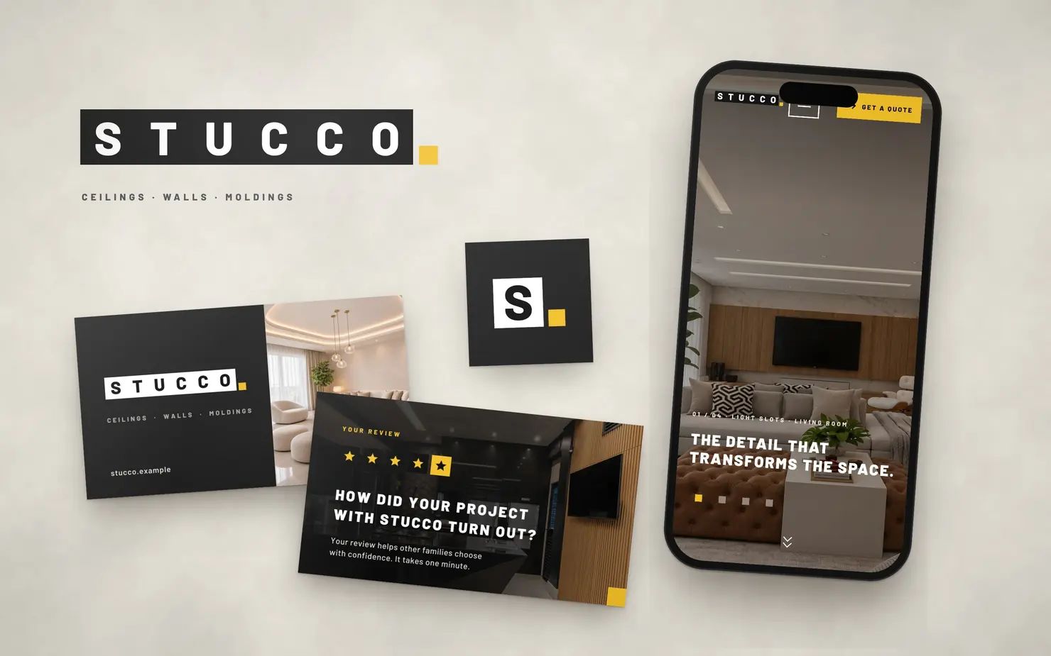
- A logo built from typographic blocks with a yellow dot, working in positive, in negative and on yellow.
- An animated version of the logo, where the dot drops into place and the blocks rearrange. It became the site's signature.
- A palette of graphite, black, beige and yellow, Barlow type and a language of blocks and “pixels” repeated across the brand.
- A style guide with colors, type, components and usage rules.
- Website
- 25 pages: home, a services overview, one page for each of the five services, project gallery, about, service areas, eight city pages, contact, FAQ, review, privacy policy and a 404 page.
- A masonry gallery with more than 45 jobs, filters by service and project details on tap.
- A three-step quote form with tappable options for service, property type, project stage and area. On submit, WhatsApp opens with the message already written.
- A quote button always in view, a compact header that appears on scroll and a floating WhatsApp button.
- Scroll-linked reveal animations, like overlapping blocks and photos that open like a curtain. They respect the system's reduced-motion setting.
- Local SEO
- A service page for each specialty, with its own content, FAQ and links to the other services.
- A service-area page with a map of the 165 municipalities within 150 km, built from official IBGE data, linking to the city pages.
- Eight city pages with their own text, distance and FAQ, linked to each other and to the services.
- Titles and heading structure organized per page, descriptive alt text on every photo and images optimized to load fast on phones.
- A Google review flow that strengthens the business profile in local search. The review page is kept out of Google's index.
- Reviews
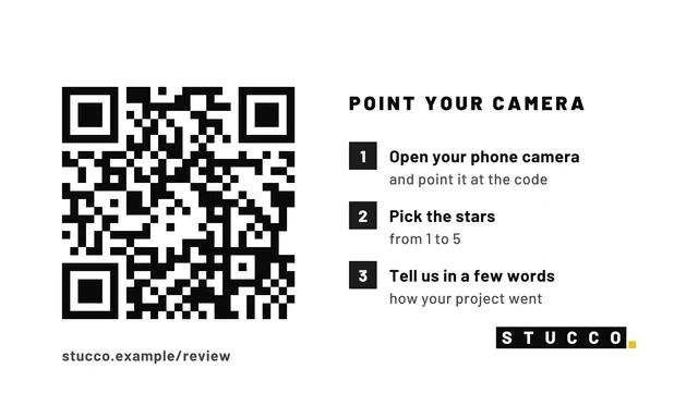
- A dedicated page that takes the client straight to reviewing the company on Google.
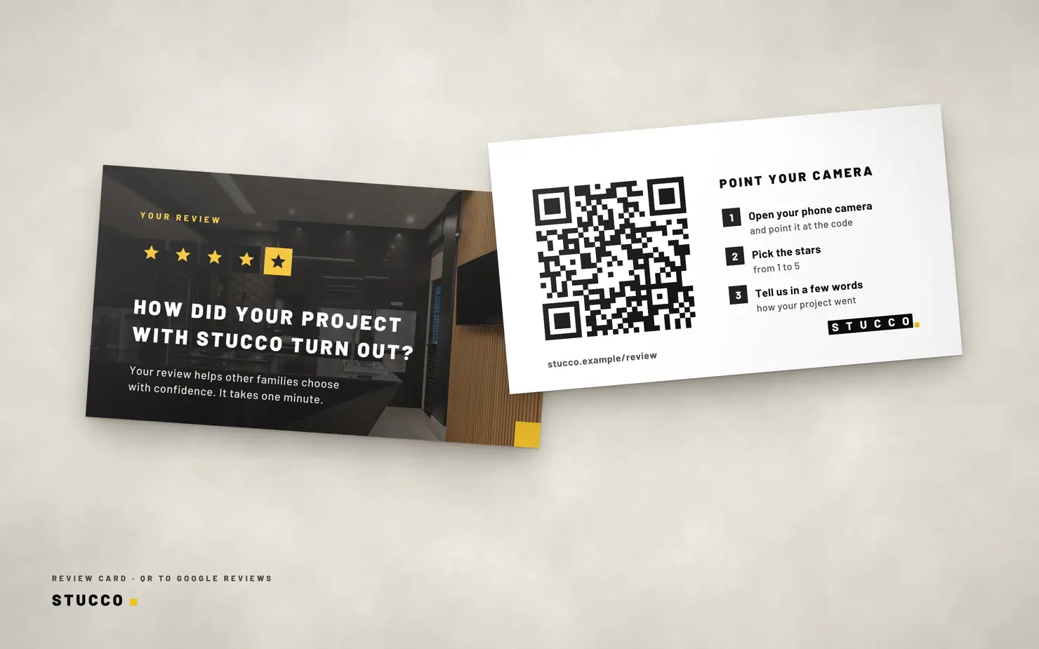
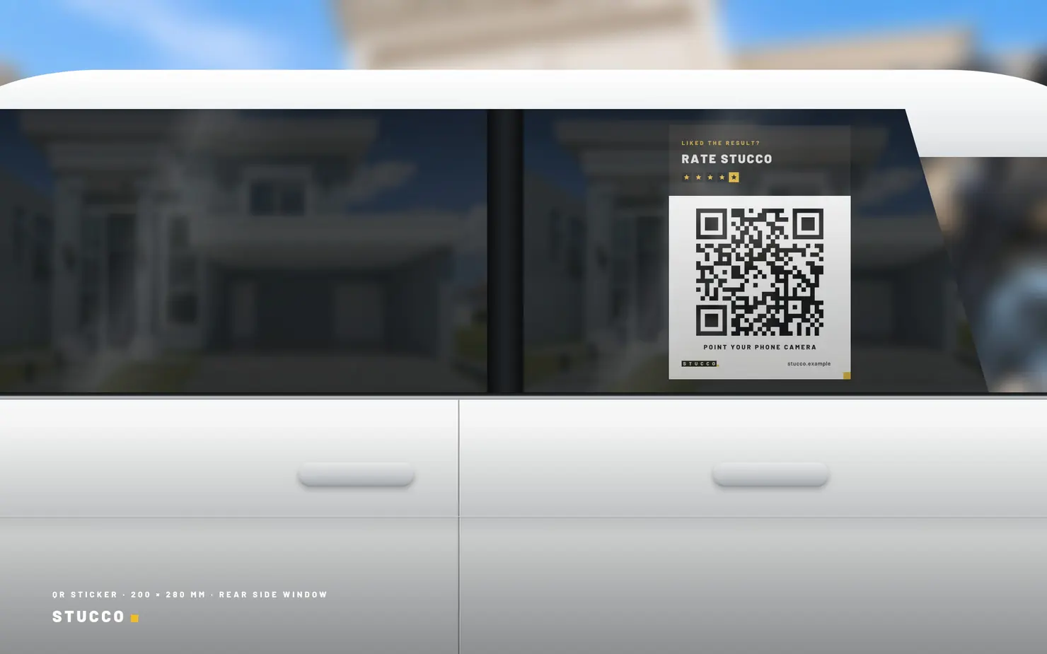
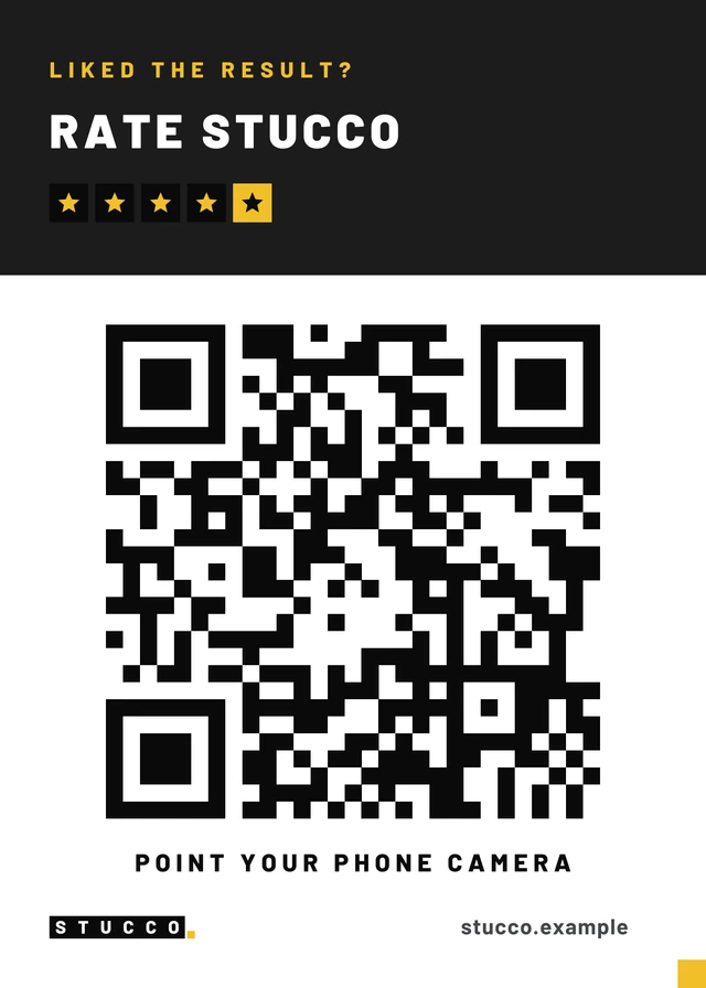
- A QR code printed on the review card and on a 20 × 28 cm sticker for the team's cars.
- Print and social
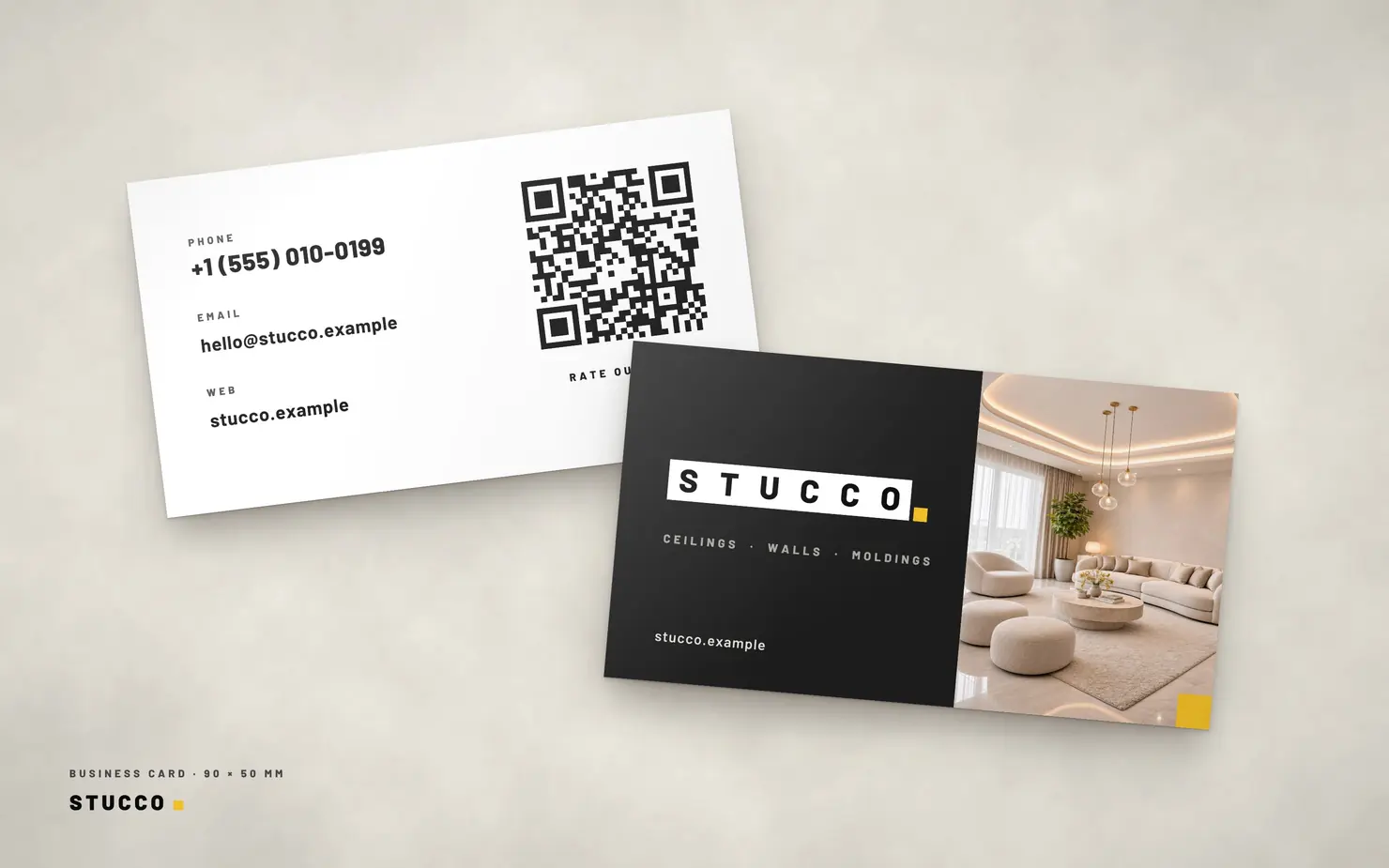
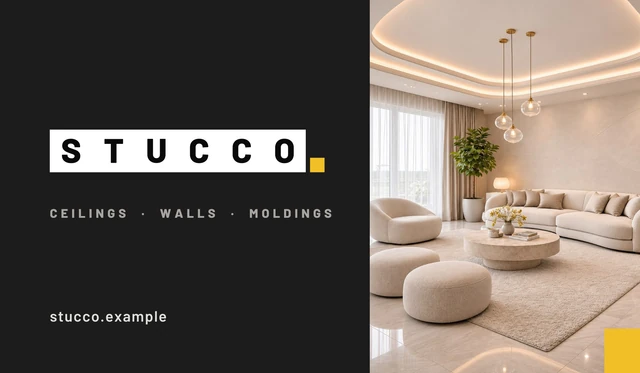
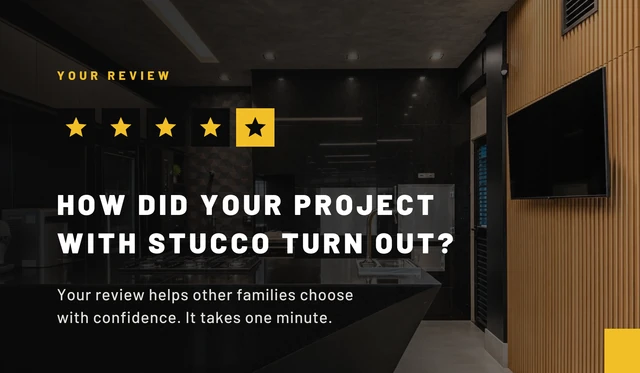
- Business card and review card at 9 × 5 cm, with bleed and crop marks, ready for the printer.
- A QR code sticker for the cars, which are already wrapped with the brand.
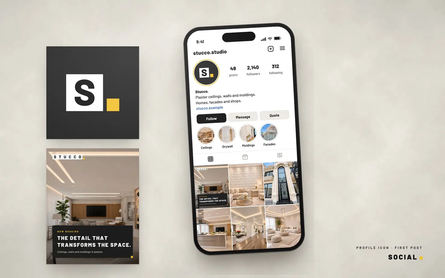
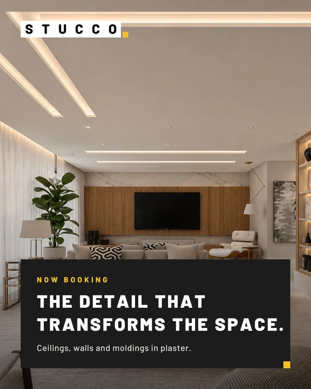
- Profile icon, a first-post carousel and a suggested bio for social media.
- Favicon in every size.
- Handoff for development
- A reference package in English with every page, color and type tokens, named images and the animated logo ready to use.
05The brand
Printed and social pieces made for the studio, shown under the fictional Stucco. name. Every QR code points to a reserved example address.

06Technology
- Site
- Astro
- Portfolio demo
- Plain HTML, CSS and JavaScript, no build step and no dependencies
- Animations
- CSS, scroll-linked
- Font
- Barlow, self-hosted
- Map
- IBGE municipality data
- Repository
- GitHub
07Result
Brand, site and materials work as one system, from the logo to the quote form. The studio now has:
- a portfolio organized by service;
- pages built to show up in searches for each city in the region;
- a two-tap path to a quote on WhatsApp;
- a review flow that starts on a card or the team's car and ends on Google.
Have a project like this? Write to mail@raioviajante.com.
Back to projects